 All blog posts
Are reviews hurting your conversion rate?
Reviews help your conversion rate, right?
It's a simple thing we've all been told throughout the years & in principal it's true. Done well, reviews have a massive positive impact on your conversion rate, site & customer experience. It's actually stunning to see how positive they can be for your store.
But sometimes, they backfire.
In working closely with 1,000+ high growth Shopify brands & studying the results on those stores, we've identified a series of best practices when implementing reviews on a site.
We hope these insights can help
It isn't one size fits all though. Getting the most out of your reviews is a series of tradeoffs & best practices that take into consideration your industry, stage & brand.
We'll be sharing a lot more on the blog, but if you want to get your own analysis, reach out to us here. We'll get back to you in 24 hours with your personalized results.

Looking at: The "write a review" button
Conclusion: "Write a review" buttons hurt your conversion rate & lower trust in reviews
Exception: Small brands & new entrepreneurs, especially makers that sell across multiple channels (ex: Etsy, in-person & Shopify)
Today, we're diving into the write a review button.
You've done the hard work of getting someone to your product page. Maybe they came to your site first through an influencer promotion (but didn't convert that time). Then a week or two later heard about your product from a friend & finally just now clicked on a retargeting ad you served them.
They landed on your product page & it loaded super fast (thank goodness for the site speed work you did). The product imagery is beautiful. Description is clear. You have easy payment options & free shipping. Everything is going great.
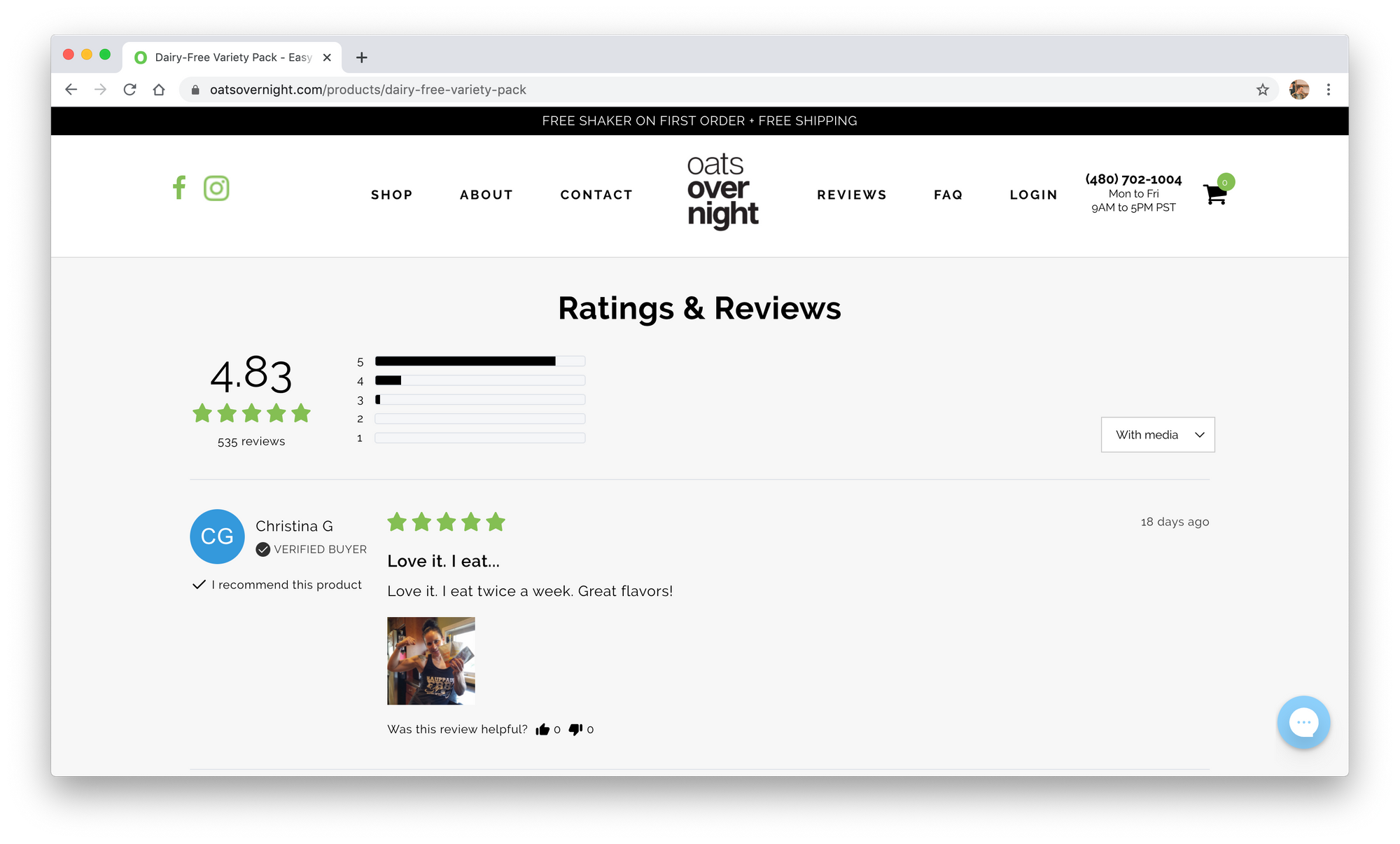
Then, they scroll down to reviews. Just looking for a couple regular people sharing their experience with the product & they'll buy...
But before they find reviews, they see a button. "Write a review".
And you've lost them.
There are two things that can happen when a customer sees the "Write a review" button on your product page.
1. There is risk of them getting lost, annoyed & distracted
When someone is that deep in the funnel, you should only be asking them to take one action. Purchase! Anything else spends scarce attention & energy.
The write a review flow is pretty disorienting for someone trying to decide if they're going to make a purchase. It's completely unrelated!
In 2005, PetCo was one of the first 10 websites in the world to have customer reviews, using their iconic paw print in place of stars.

The addition was incredibly impactful for the business. They saw increased sales, decreased returns, all using a "write a review" button! But at that point in time, "write a review" buttons were all they had.
The write a review button is a hack from 2005. Version 0.01.
There's a better way.
If you're driving a meaningful amount of new visitors to your product page, don't waste a customers attention asking them to write a review.
2. It makes customers trust reviews less
Ogilvy's famous line “the customer is not a moron” rings true in this case.
If a new customer sees that literally anybody (including them) can write a review, they’ll naturally trust the content of your existing reviews much less. Once the integrity of your reviews is gone, so to is the power they hold over a customer.
Trust is the single most important element in reviews success. Full stop.
If your customers do not trust the authenticity of your reviews, there's little point in having them.
So... how do you get reviews then?
The same way you've already been getting 90% of your reviews, the post purchase review request flow! You get better reviews there, with amazing media, it makes natural sense & it doesn't hurt your conversion rate.
With a little work on your submission flow & forms, we can typically help you get even more reviews too (but that's for another blog post!).

If you're already using Junip, or considering a migration, this is a simple toggle under our advanced display settings. For other review vendors you may have to wrestle with the code a bit.
The write a review button was never a good idea for large brands. Hopefully this can start to put an end to it.
The exception
As we'll see in all these posts moving forward, any good rule comes with an exception. This one is pretty straightforward.
Small brands & indie makers, especially those who sell across multiple channels, may benefit from the write a review button. If this is you, your online store could represent a fraction of your total orders. You also aren't buying significant paid media to drive new visitors.
In this case you might have a friend who grabbed a product from you in person, they should probably still be able to write a review on-site.

So what should you do?
If you're still starting out & mostly growing through word of mouth, you might be able to get away with having the button on site.
If you're operating at scale, driving a meaningful amount of new visitors to your product page, get rid of the write a review button. You'll see a lift in conversions & customers will trust reviews more.


